Web App Design
2020
Role
Context
It faced the challenge of scaling its web app for other businesses and individual groomers; our goal was to overhaul the user experience to facilitate this growth.
Dive Deeper
Our initial step involved diving deep into user research. We uncovered crucial insights by interviewing users, admins, and managers and observing product interactions. This process highlighted user pain points and preferences, laying the foundation for our design approach.
75%
70%
8 Mins
8 Users
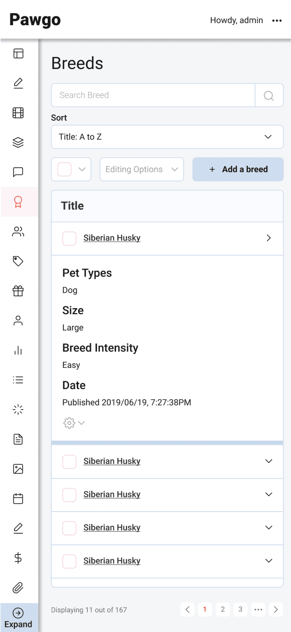
Define
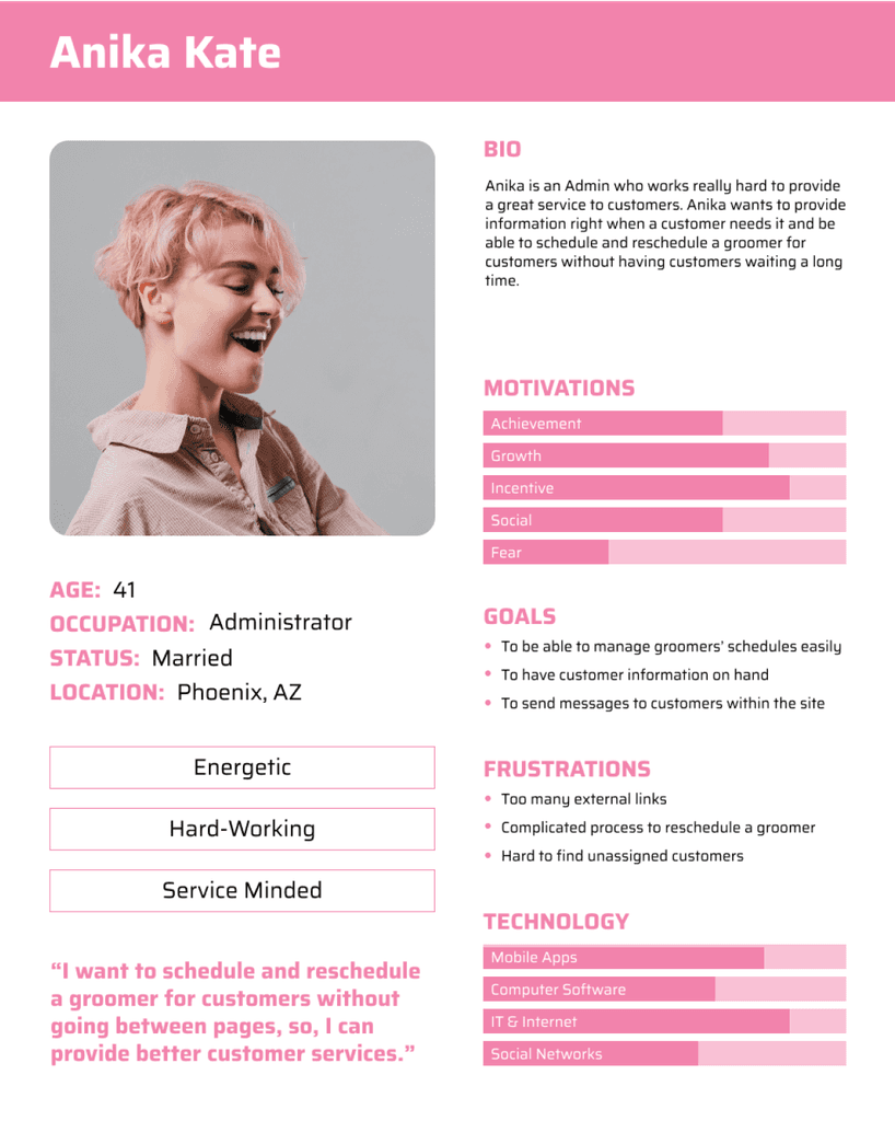
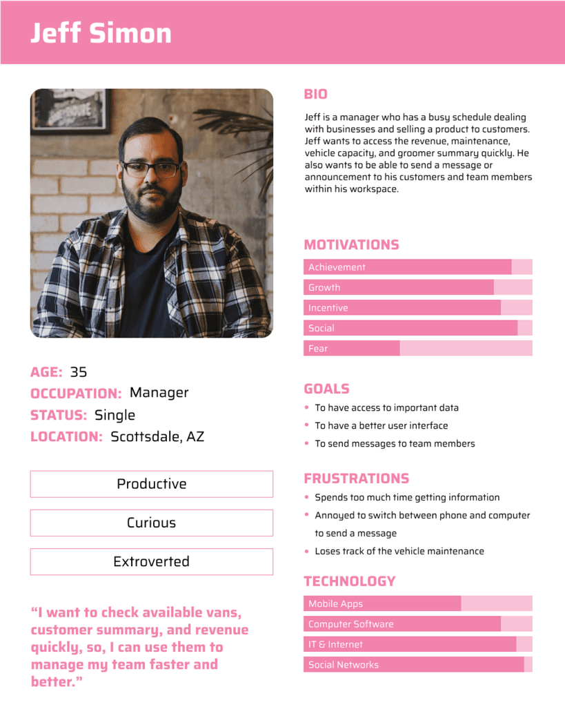
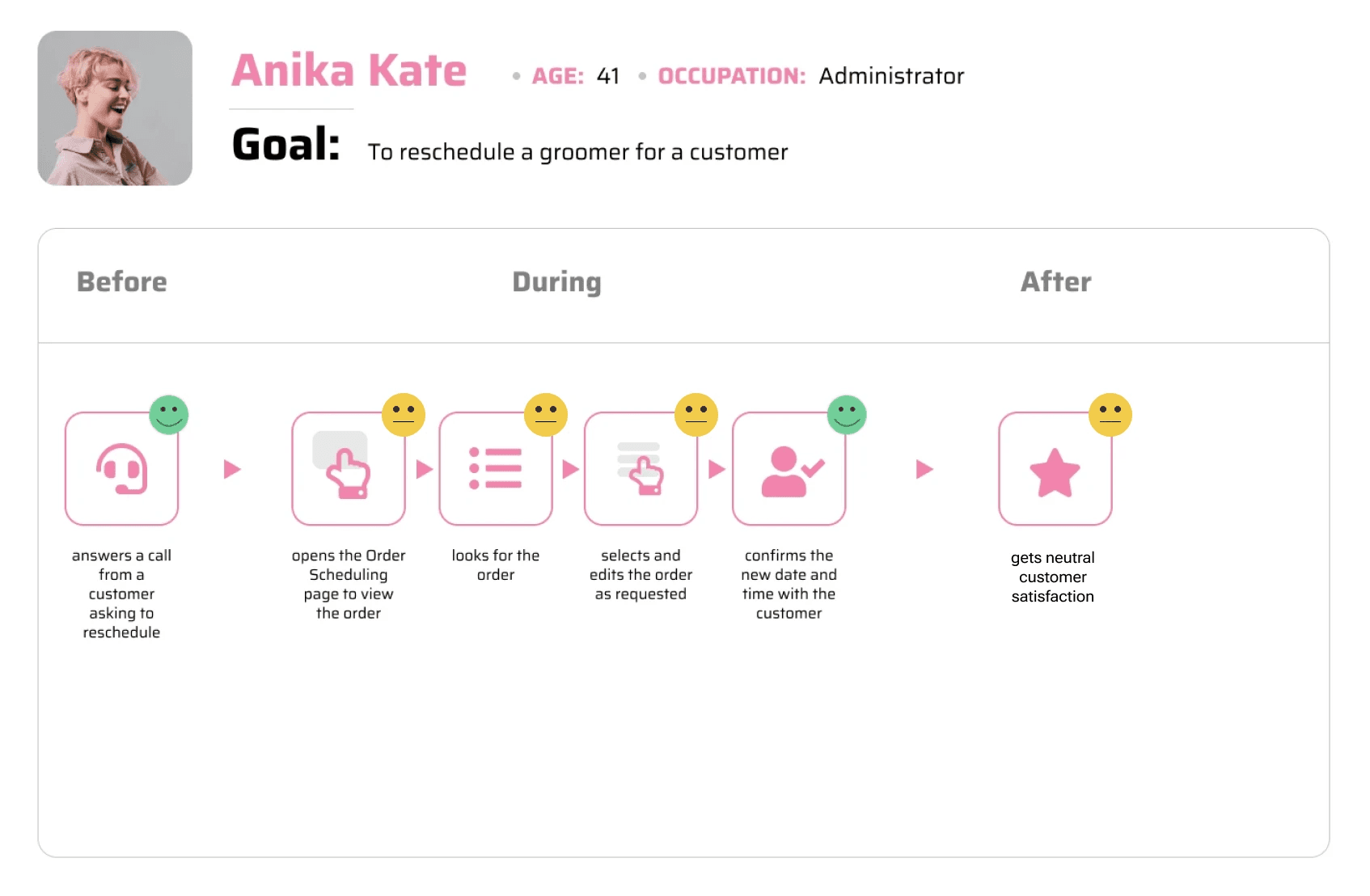
Armed with these insights, we crafted detailed personas to represent our diverse user base. These personas and user journey maps helped us effectively anticipate and address user needs.
HMW Statement
Solution Ideation
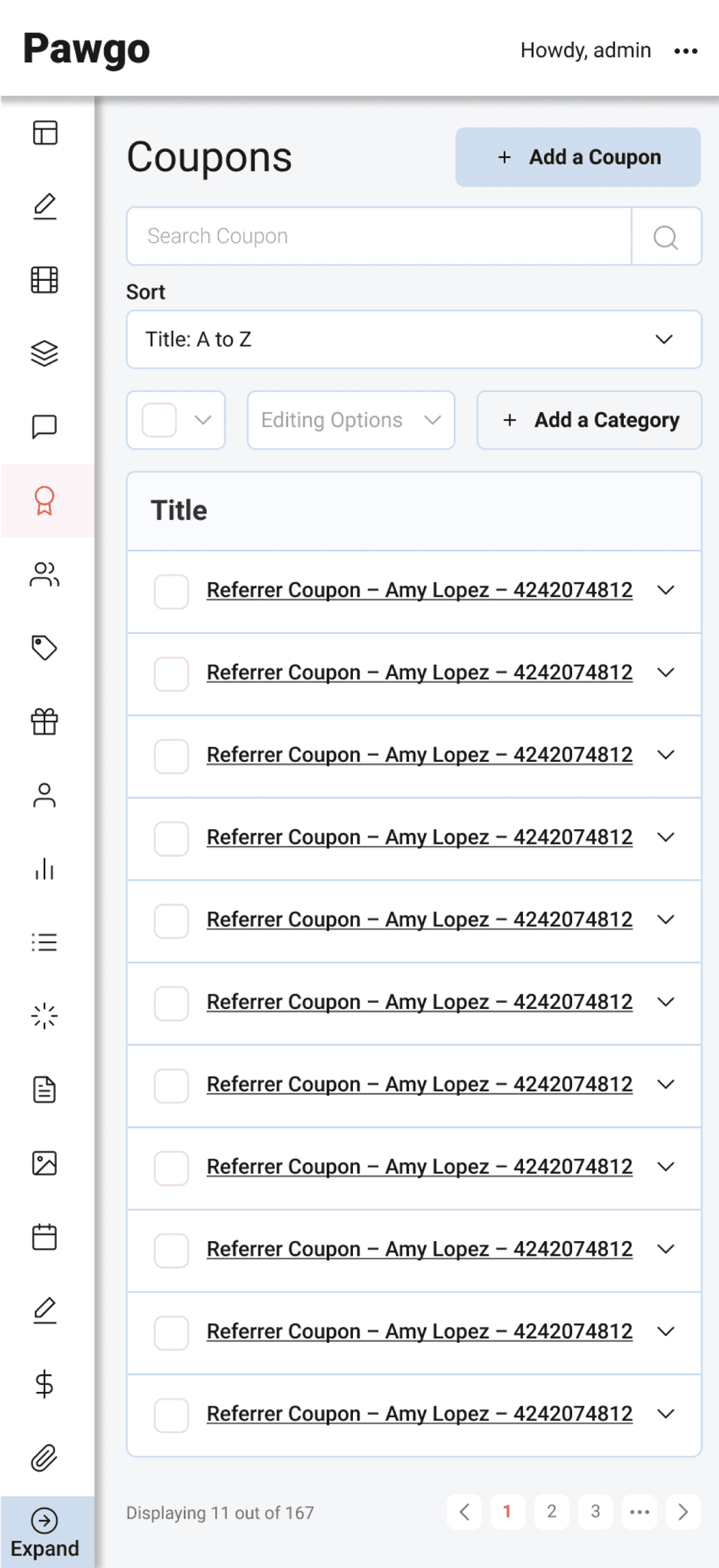
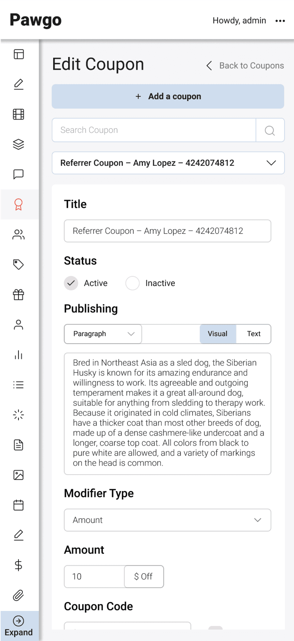
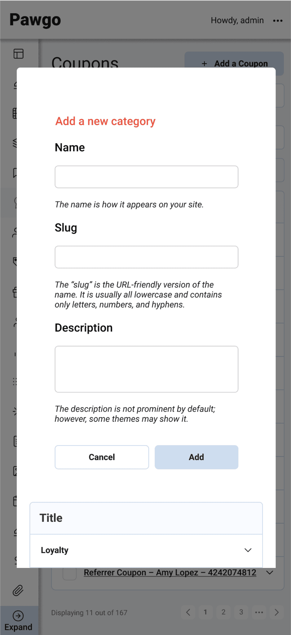
The primary design challenge was balancing information richness with simplicity.
We minimized scrolling through tabs to address this and implemented clear sorting and filters.
A key feature introduced was an order prioritization system. This system allowed users to organize and prioritize grooming appointments efficiently, significantly reducing scheduling errors.
Amidst a tight launch deadline, our collaborative design approach and rapid iterations based on user feedback refined our designs, ensuring they met the users' needs while aligning with business goals.
Solution
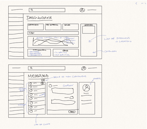
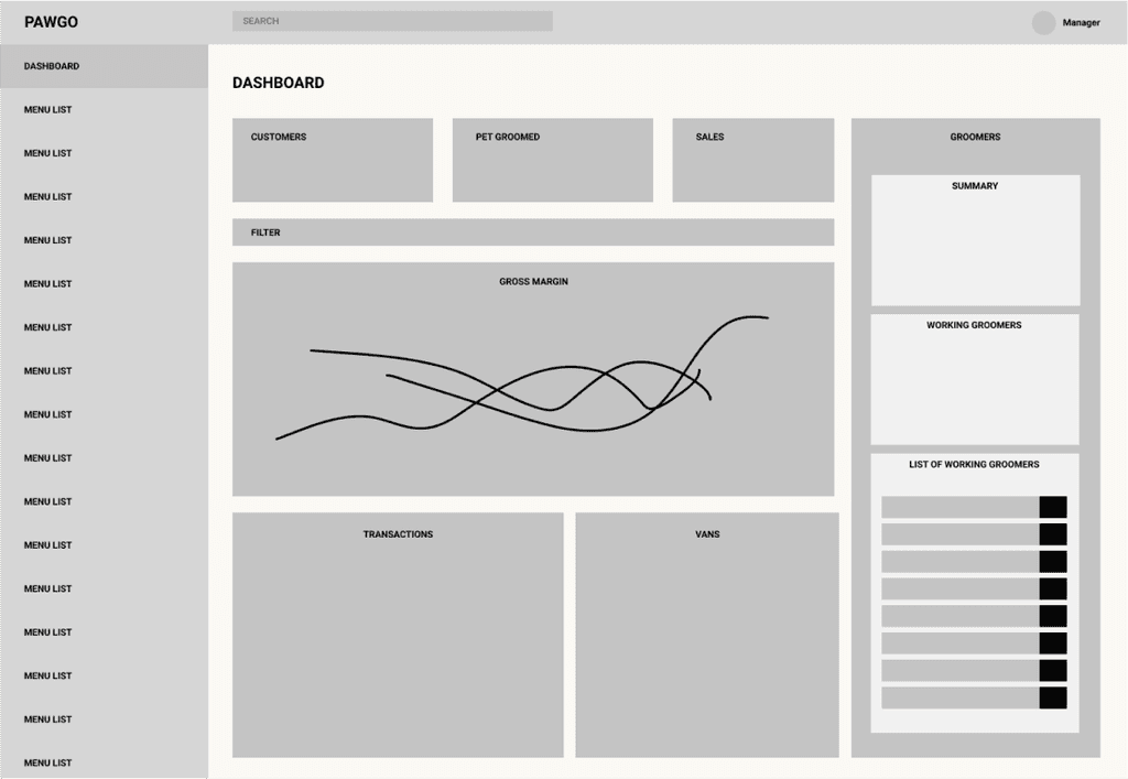
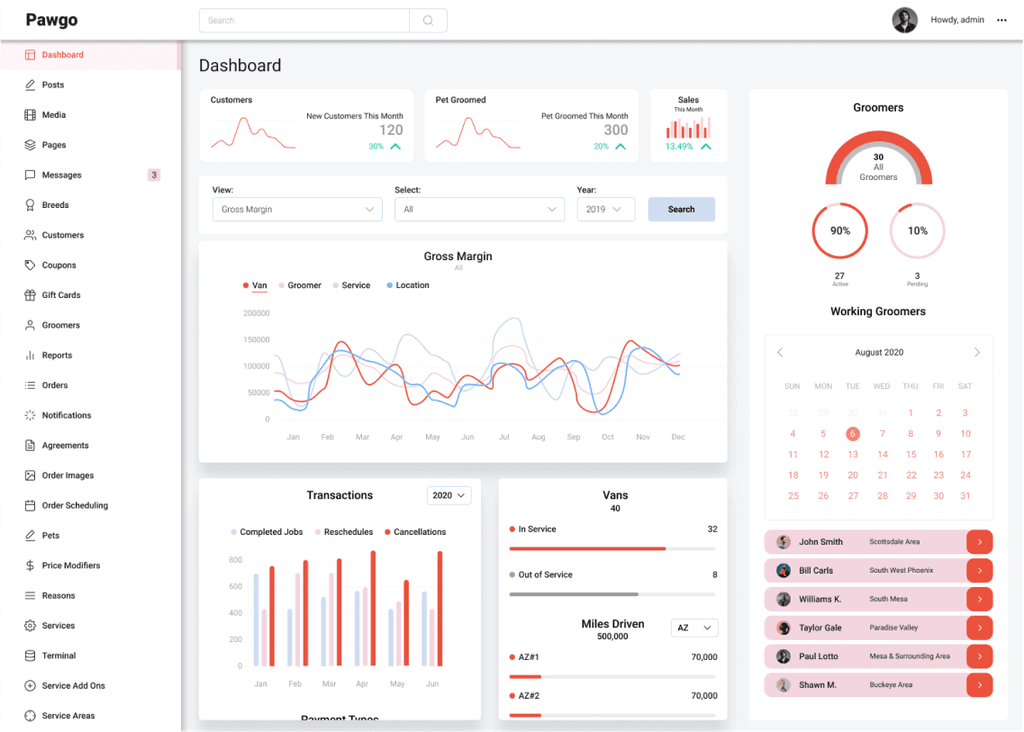
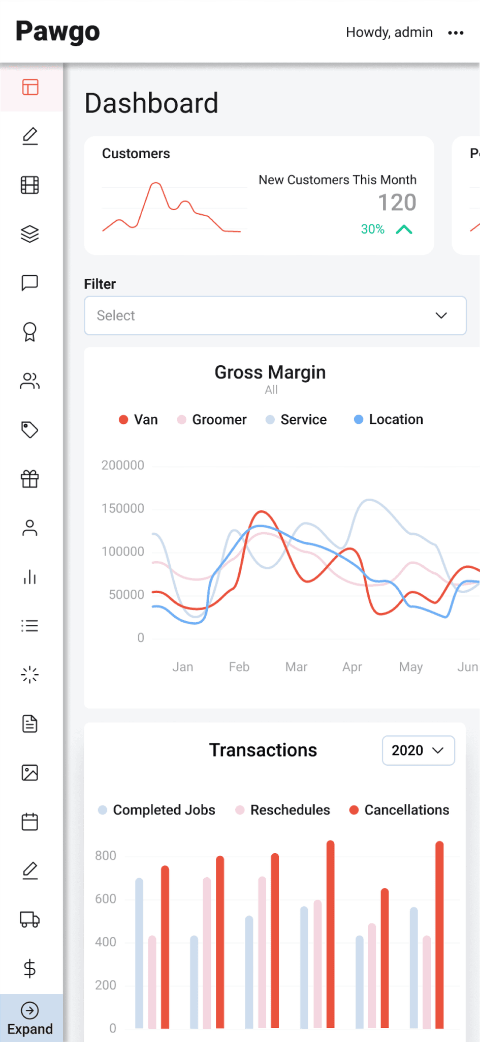
Streamlined Information Display
Key metrics like new customers, services completed, and sales are presented with clear visuals, allowing for quick comprehension.
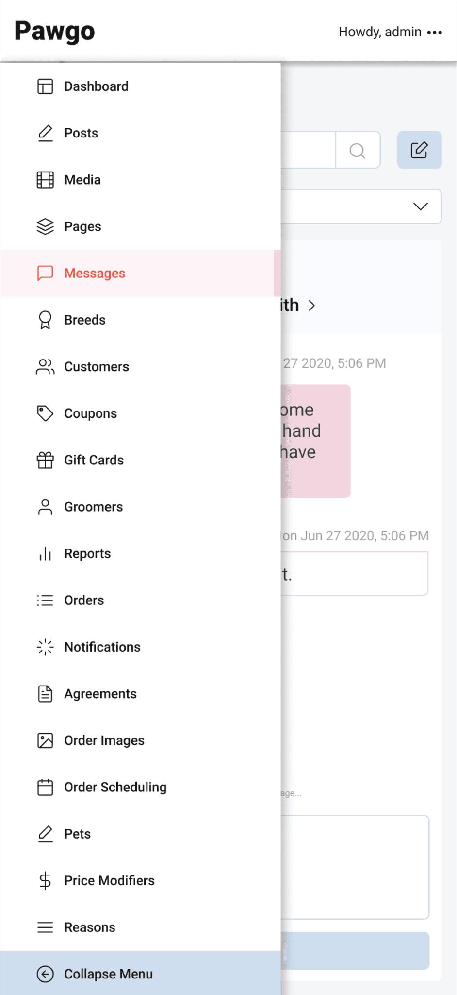
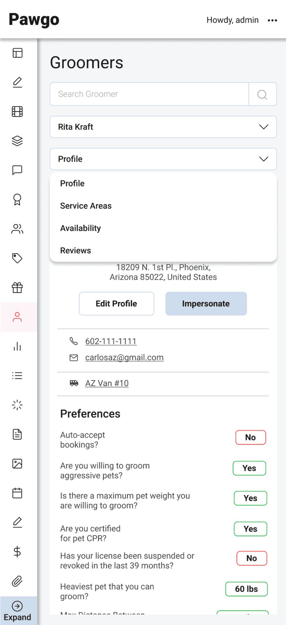
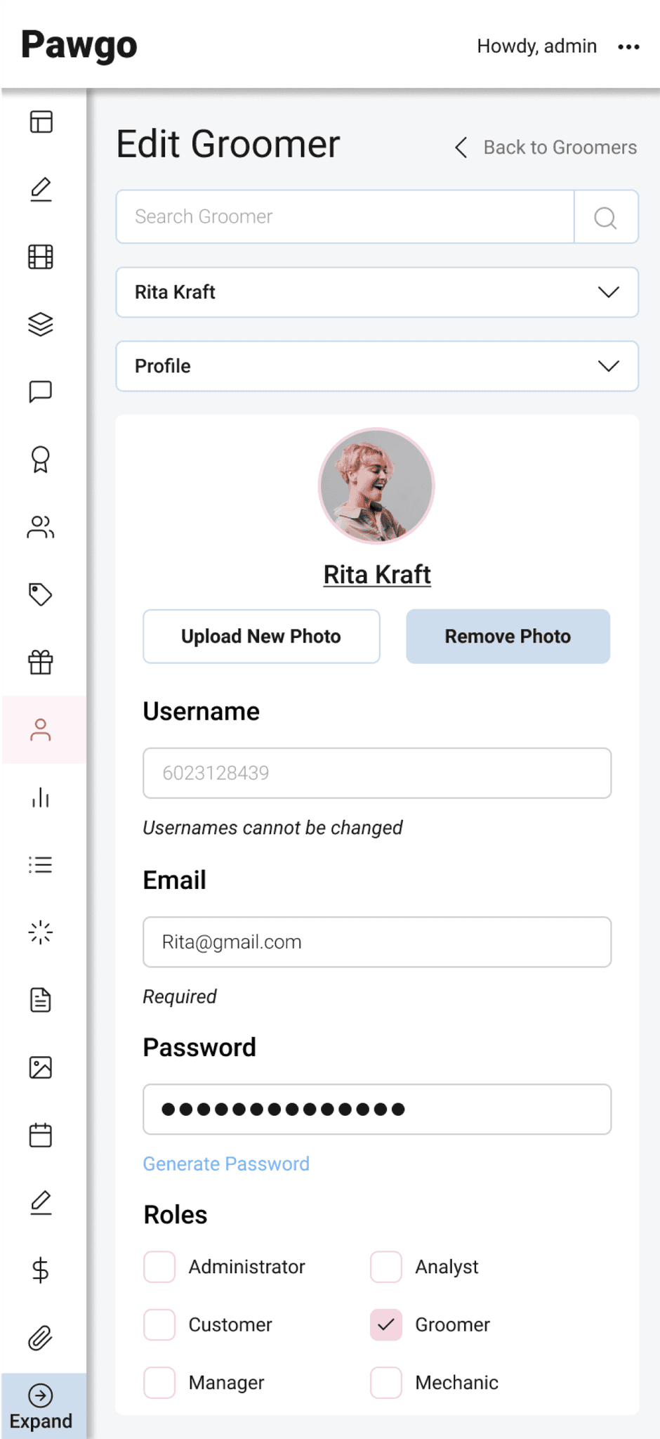
Simplified Navigation
A more intuitive sidebar allows users to access different sections with fewer clicks, saving time and reducing cognitive load.
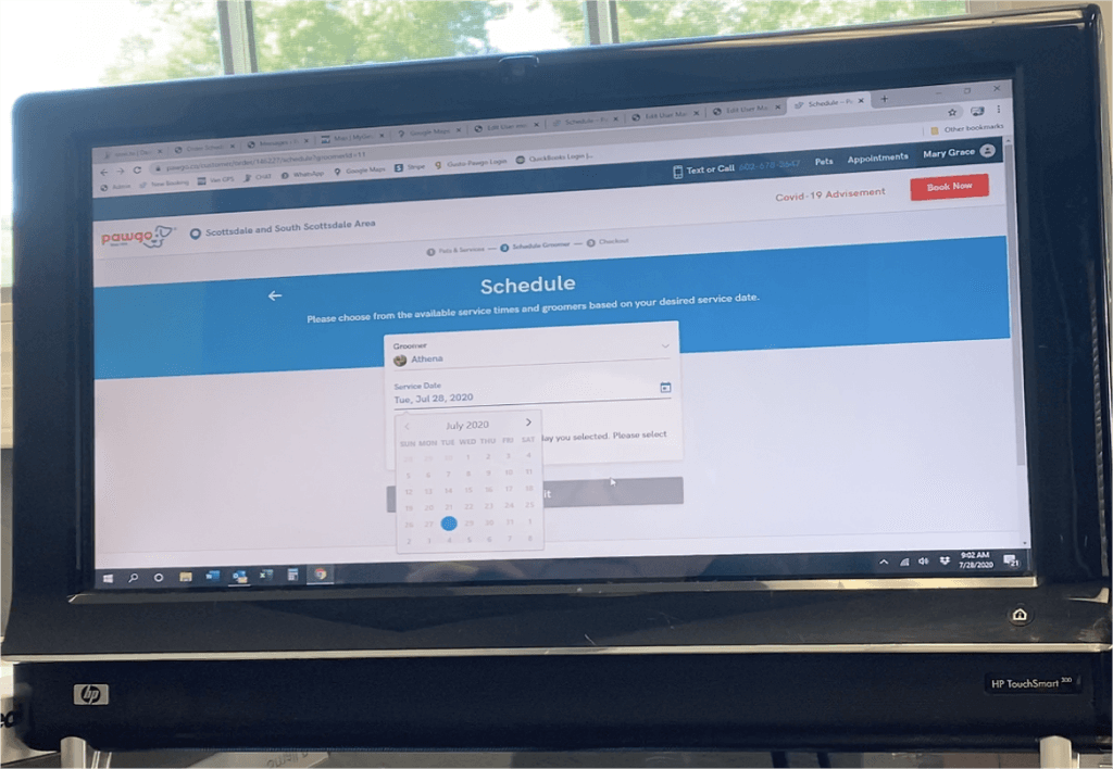
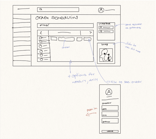
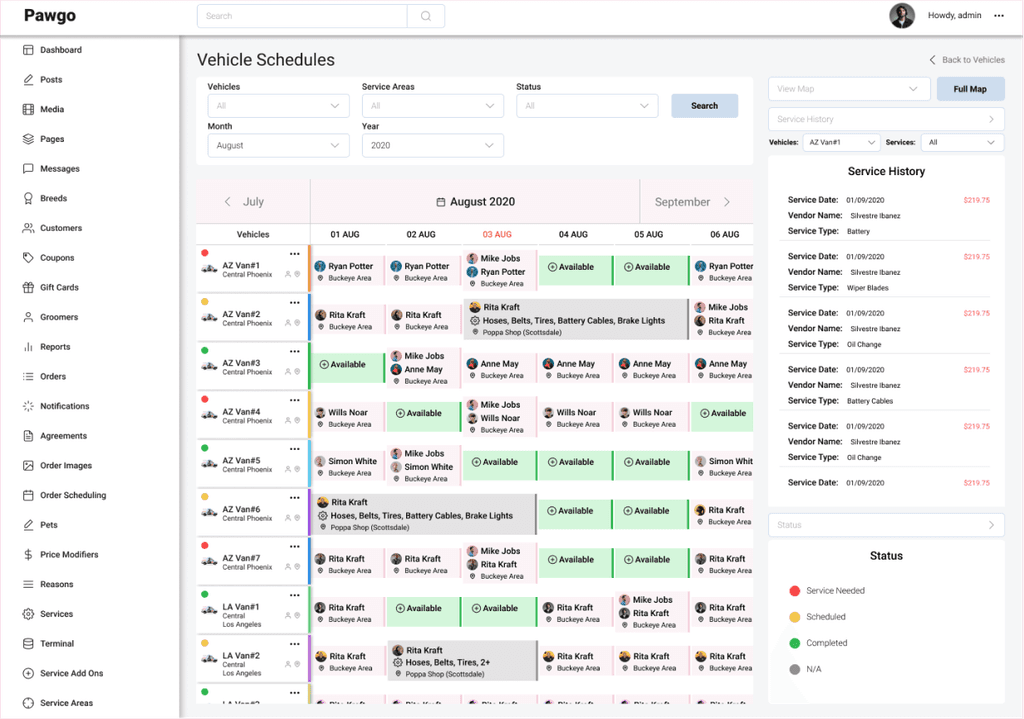
Dynamic Scheduling Tool
An interactive calendar provides a real-time view of groomer schedules, enabling users to prioritize orders and avoid double-booking, all within a user-friendly interface.
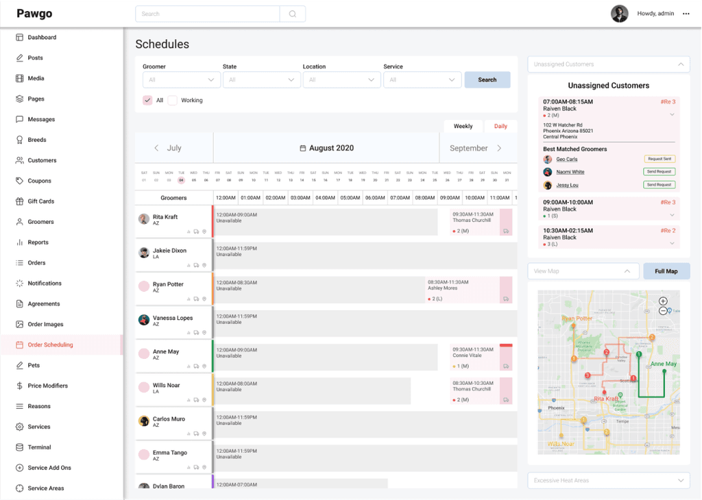
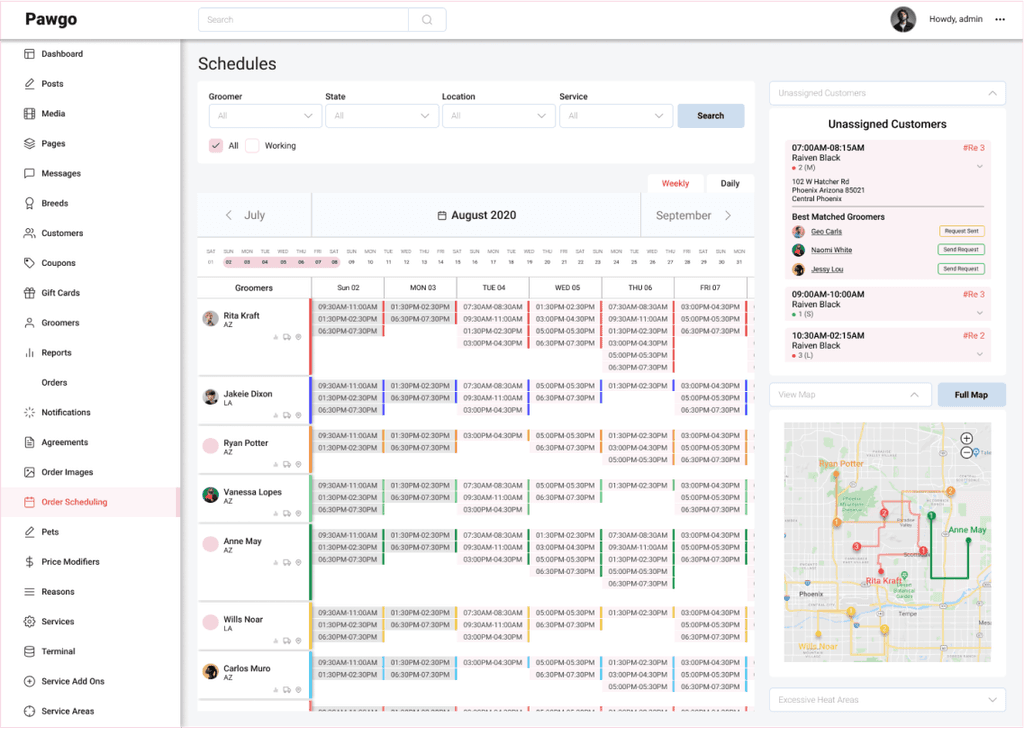
Solution
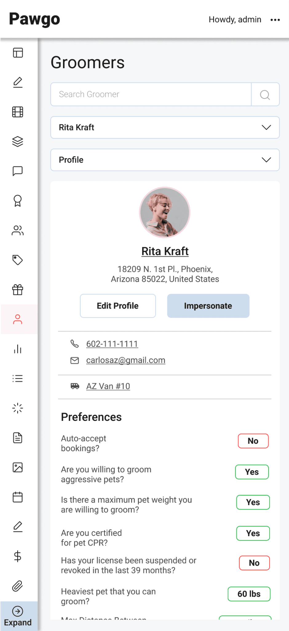
Unassigned Customer Queue
A dedicated panel for unassigned customers ensures that no appointment goes unnoticed, and the best-matched groomers are suggested for efficiency.
Enhanced Filtering
Users can filter schedules by groomer, state, location, and service, allowing for quick and targeted views.
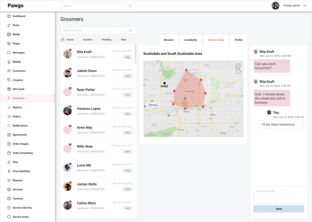
Map Integration
The full map view provides a geographical perspective of appointments, allowing for optimized routing and assignment.
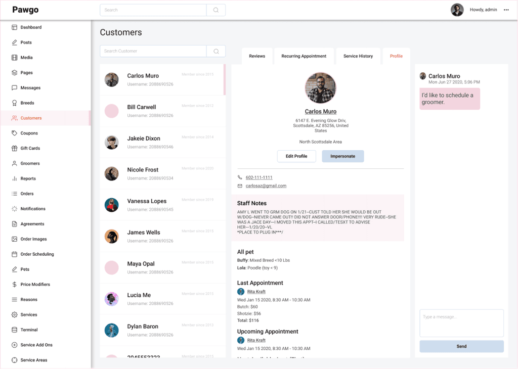
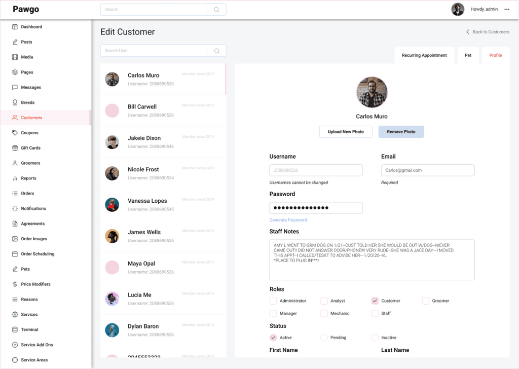
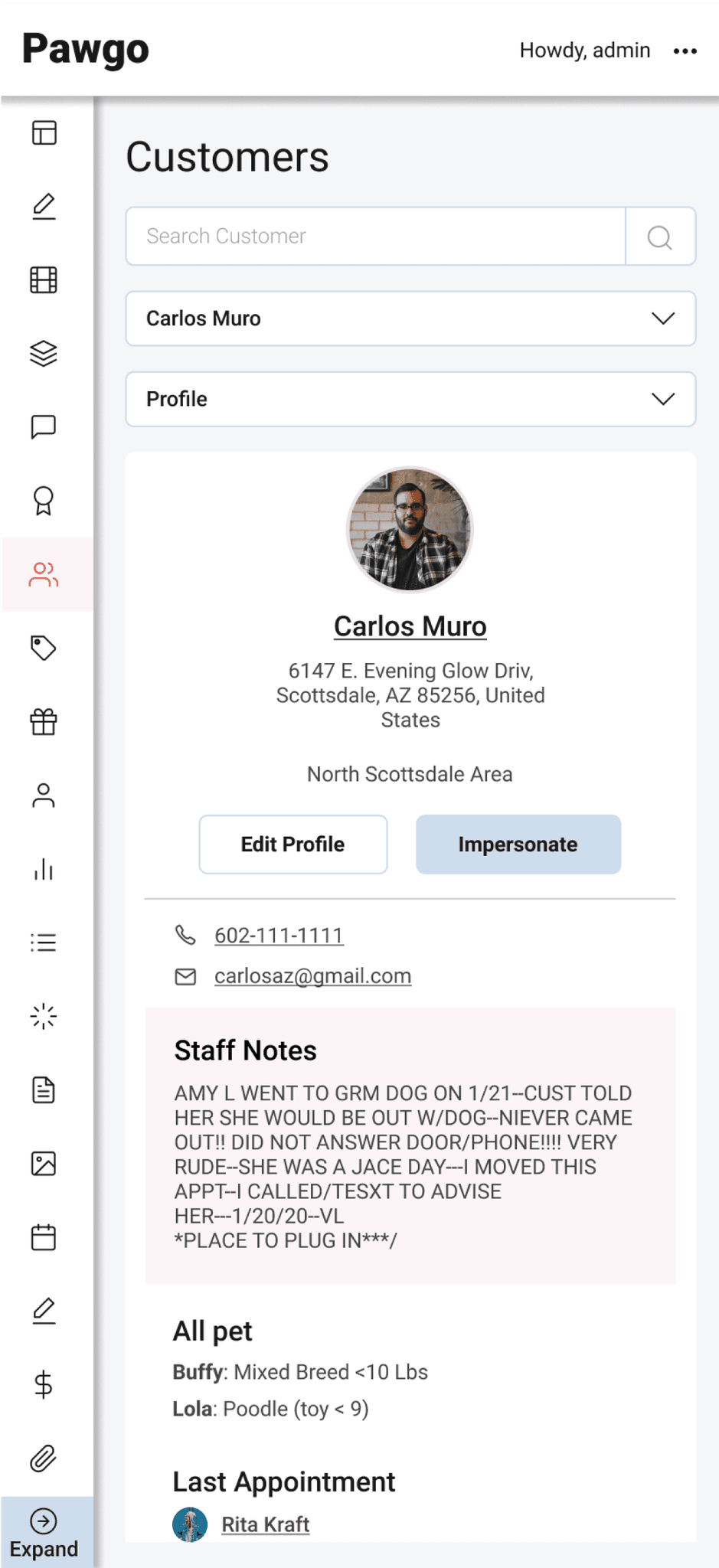
Solution
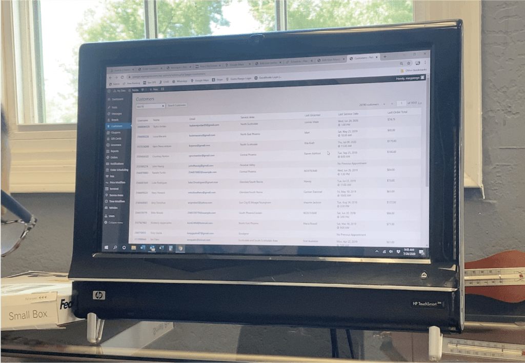
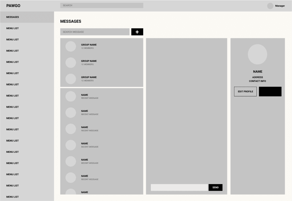
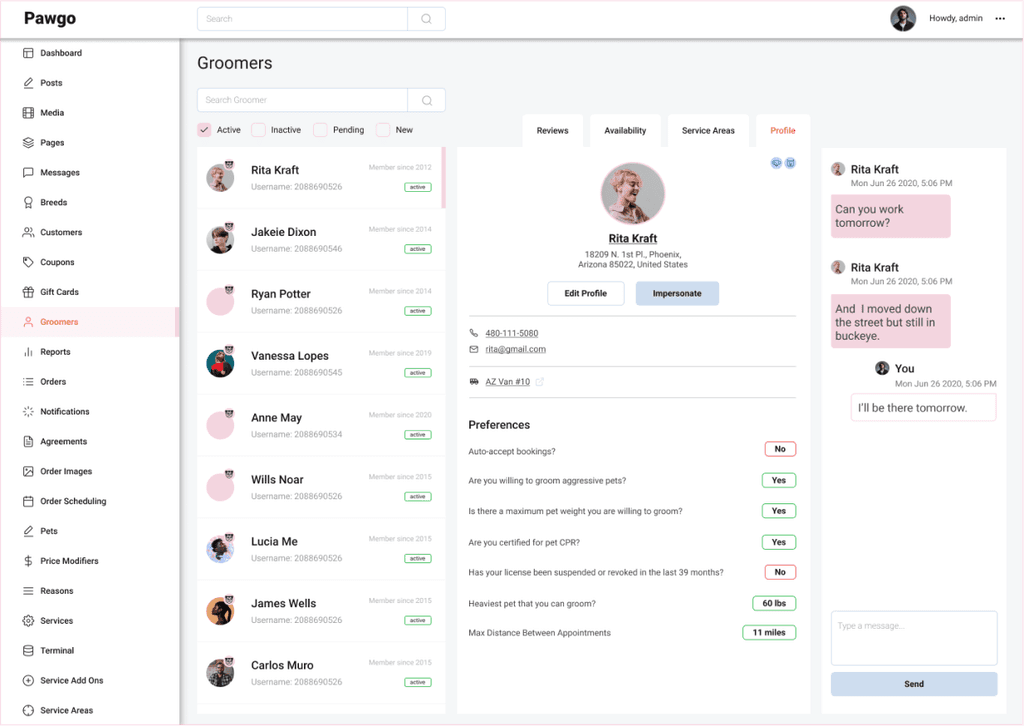
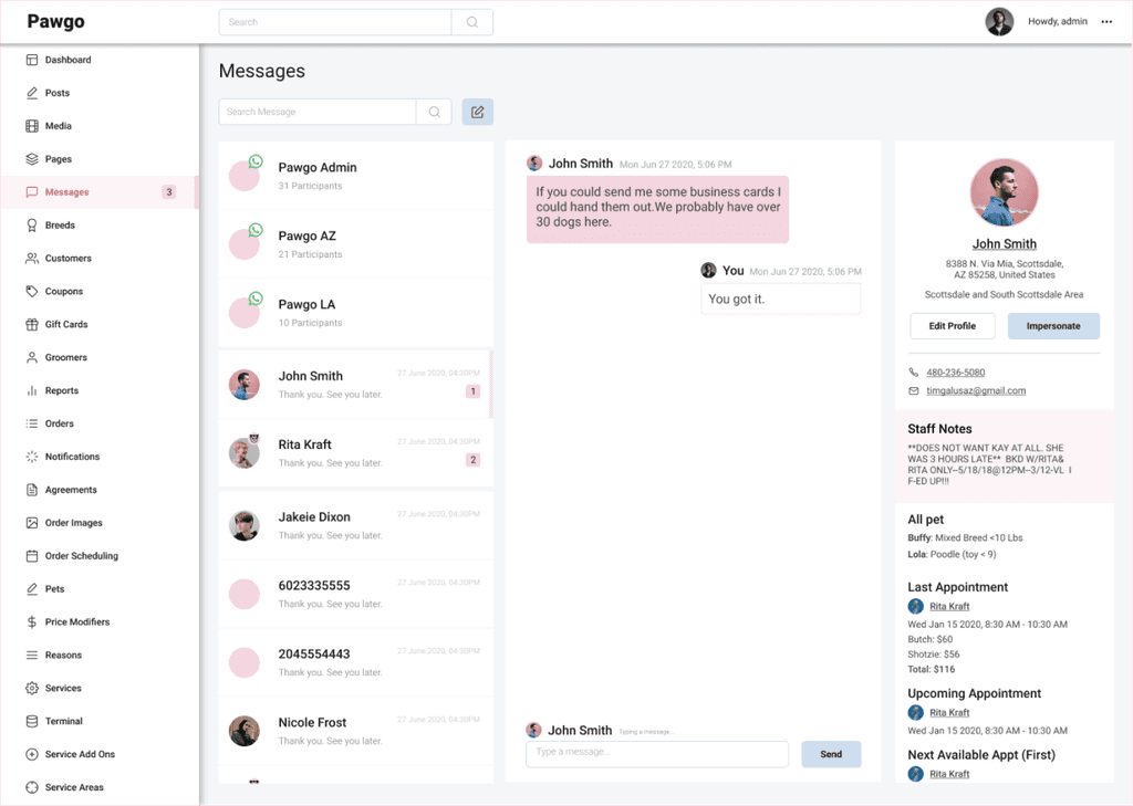
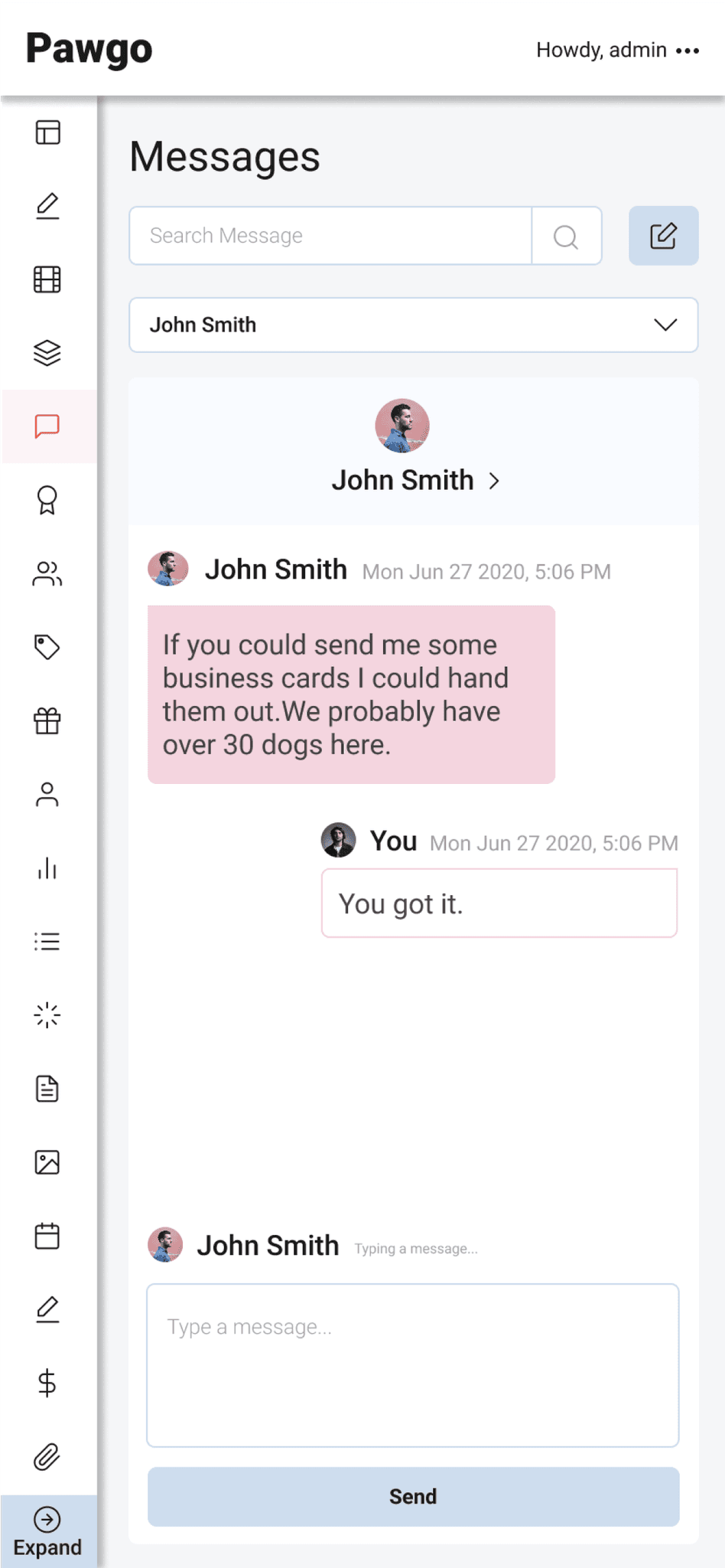
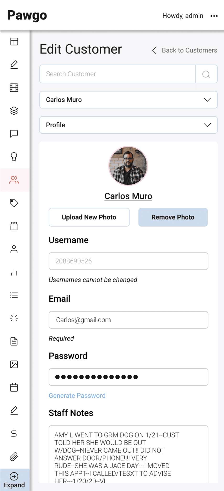
Consolidated Customer Views
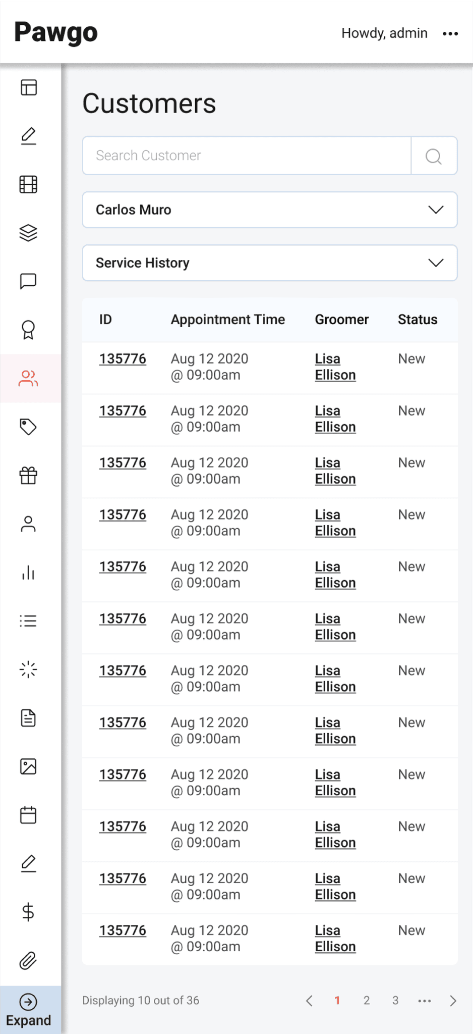
A unified profile section where users can see personal details, pet information, appointment history, and notes in one place.
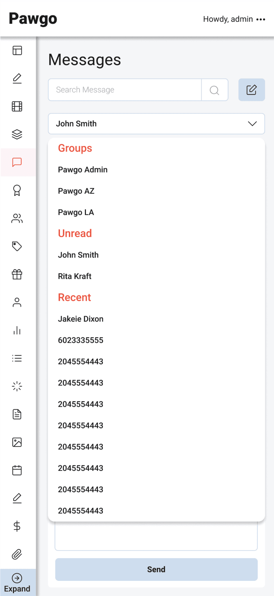
Integrated Communication
A direct messaging feature is now embedded within the customer's profile, enabling immediate contact and enhancing the customer service experience.
Impact
90%
Post-launch, a survey of 50 users indicated a 90% satisfaction rate with the new order prioritization feature, validating its effectiveness.
60%
A/B testing of the dashboard layout with ten users resulted in a 60% faster navigation to critical features.
80%
After introducing the order prioritization feature, user testing with eight admins showed an 80% decrease in scheduling errors.
60%
Feedback from weekly user test sessions led to three major iterations of the interface, each enhancing user flow and reducing task completion time by an average of 60%.
More projects
Morning Brief